A 360° multidisciplinary Art Director and Designer based in London, working at the intersection of creative direction, production and design – exploring visual storytelling and brand aesthetics with global creative talent.
Currently Art Director at Visual Talent, he leads the creative output of print and digital media at Wonderland and Man About Town titles.
Clients Include
Nike
Currently Art Director at Visual Talent, he leads the creative output of print and digital media at Wonderland and Man About Town titles.
Clients Include
Nike
Bvlgari
Boie USA
Cartier
Chanel
Coal Drops Yard
Cutler And Gross
Dior
Fendi
Fila
Toni-Blaze Ibekwe
Gay Times
Givenchy
Louis Vuitton
Man About Town Magazine
Pas Normal Studios
The Body Shop
The North Face
The British Embassy
Wonderland Magazine


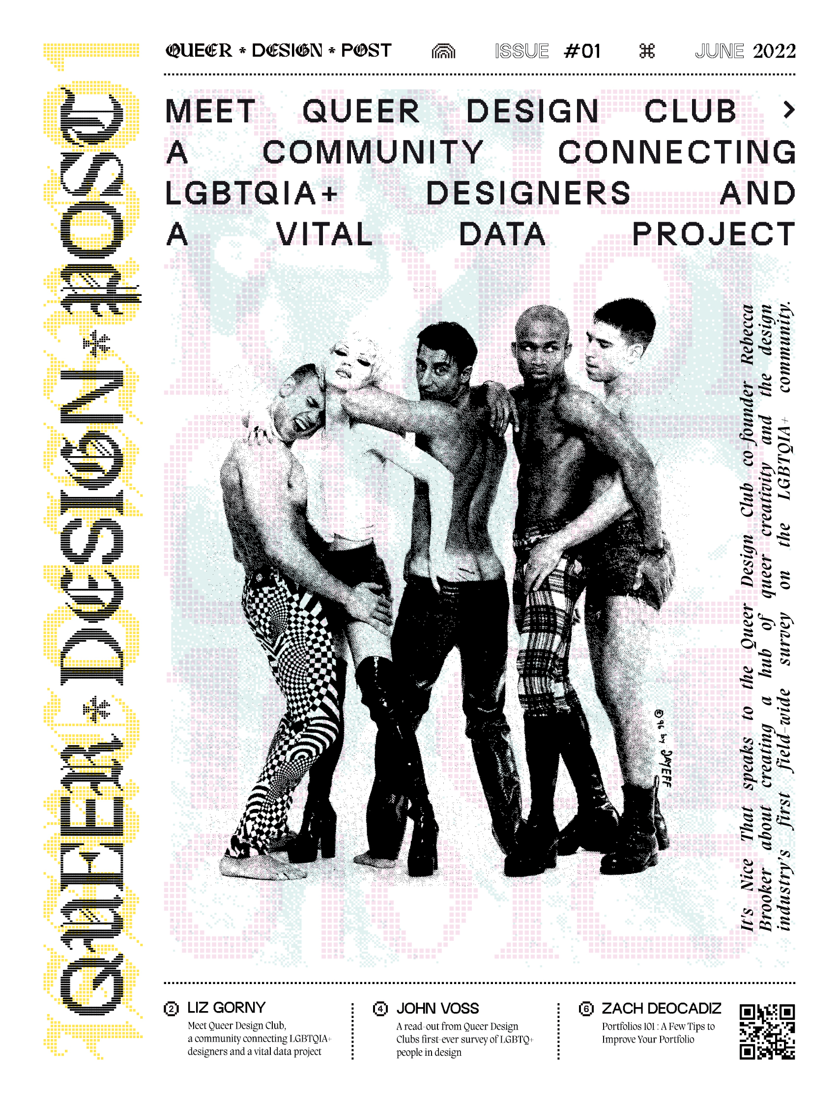
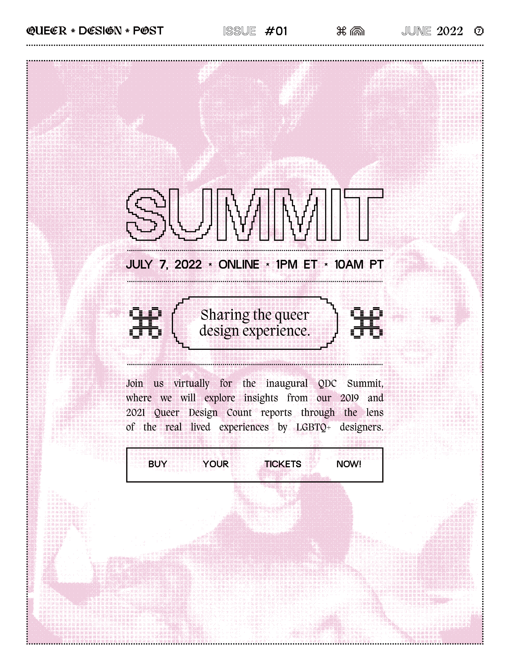
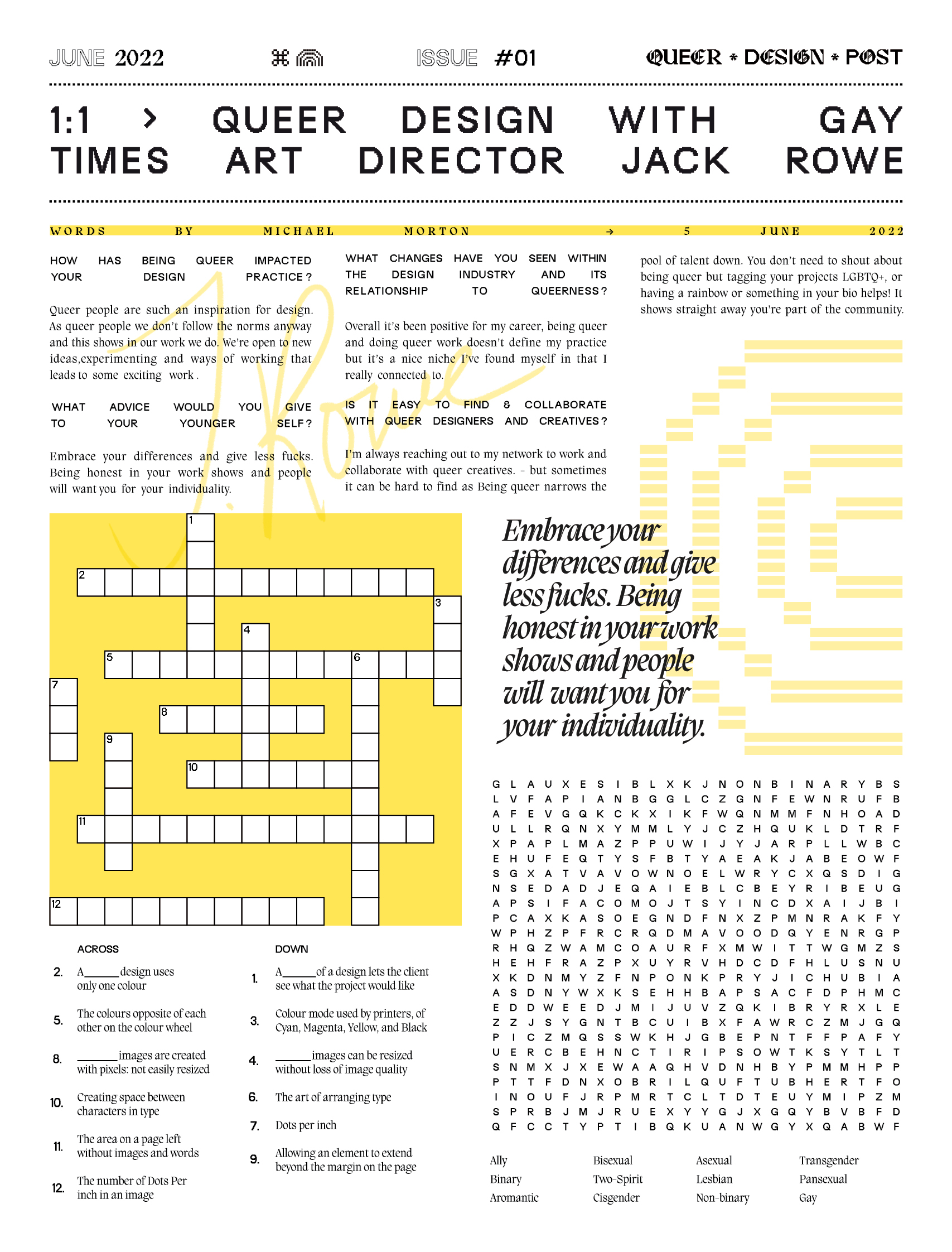
Queer Design Club
Branfing / Print / Website / Identity
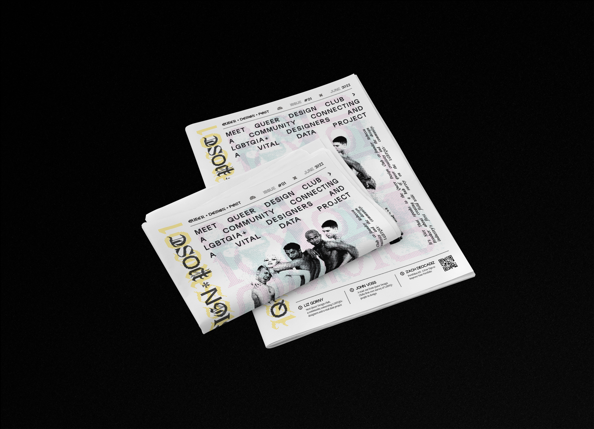
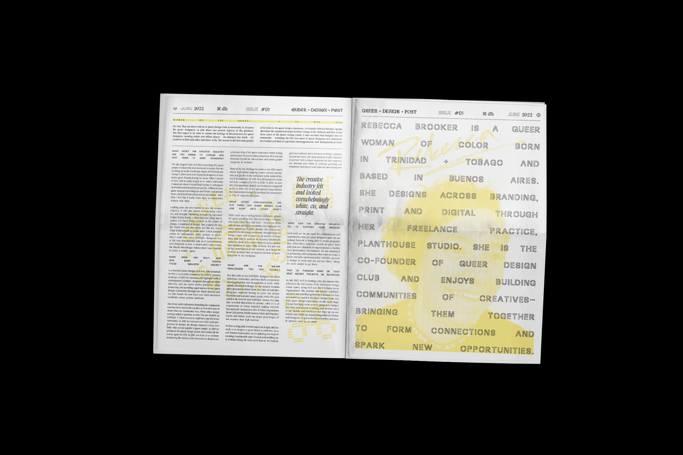
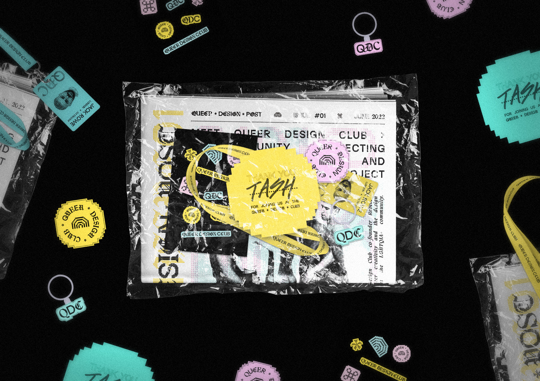
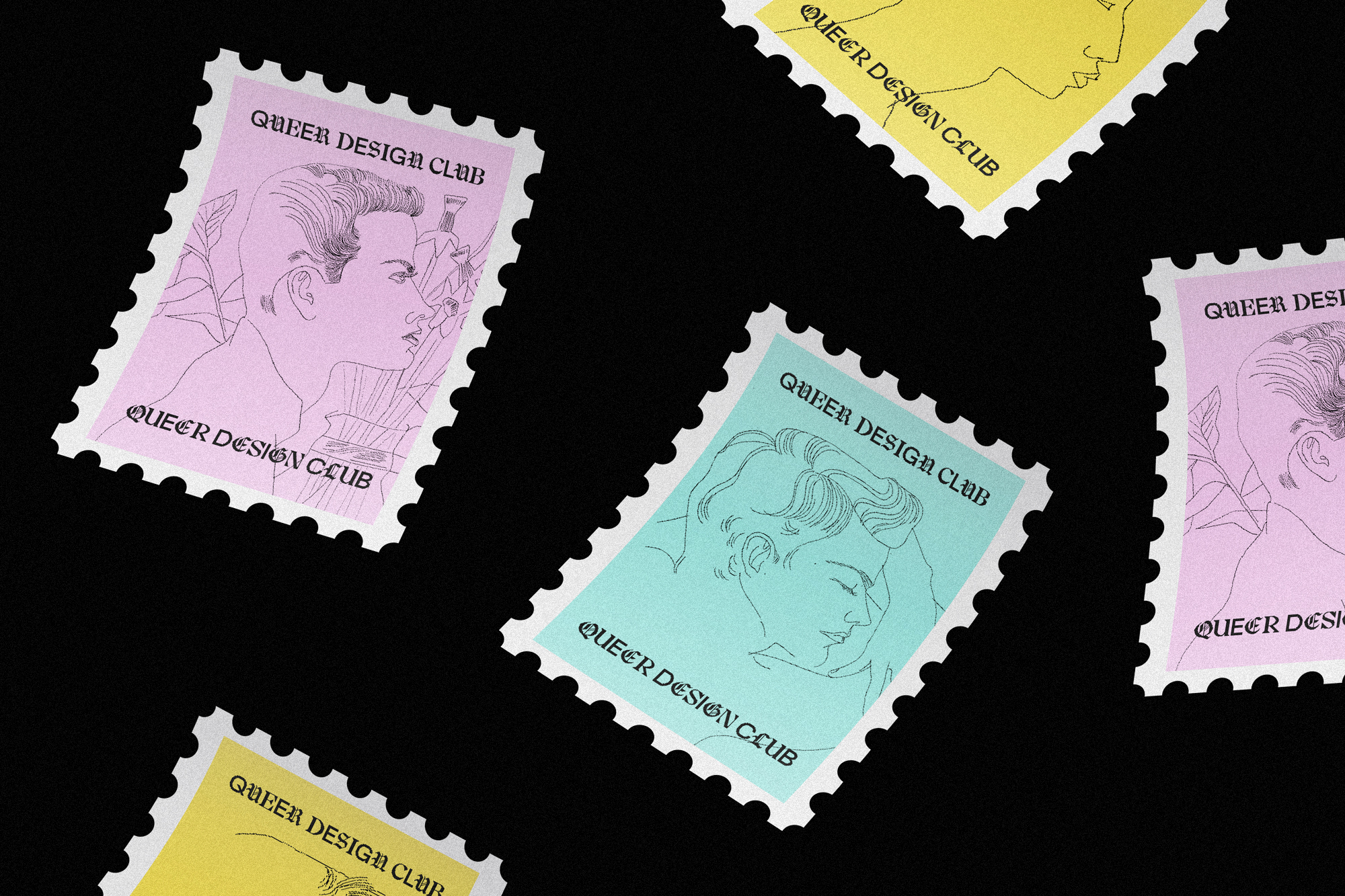
The Queer Design Club is a vibrant online community that celebrates the intersection of queer identity and design. While it has thrived as a digital platform, there is an opportunity to extend its reach beyond the screen and create a multi-channel narrative that embodies the spirit of the community. To achieve this, I developed a speculative reimagining of the Queer Design Club's brand system, incorporating a refreshed logo design, color scheme, typography, and layout. These design elements were chosen to convey the community's energy, diversity, and inclusivity.
Branfing / Print / Website / Identity
The Queer Design Club is a vibrant online community that celebrates the intersection of queer identity and design. While it has thrived as a digital platform, there is an opportunity to extend its reach beyond the screen and create a multi-channel narrative that embodies the spirit of the community. To achieve this, I developed a speculative reimagining of the Queer Design Club's brand system, incorporating a refreshed logo design, color scheme, typography, and layout. These design elements were chosen to convey the community's energy, diversity, and inclusivity.
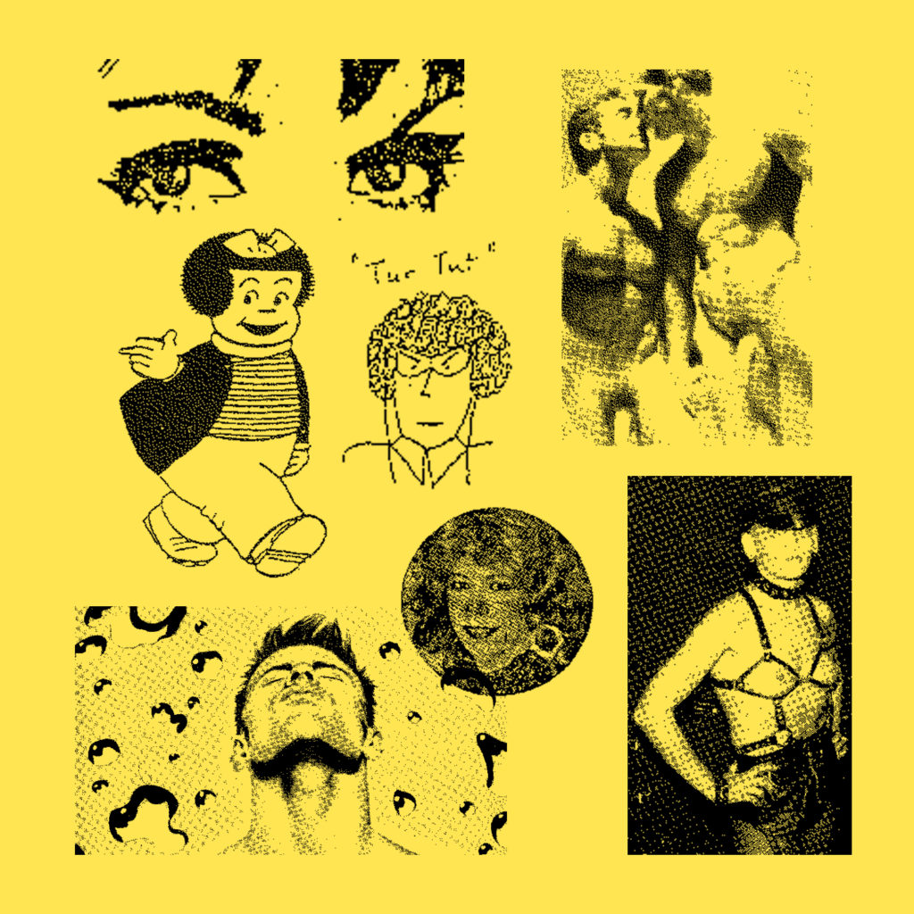

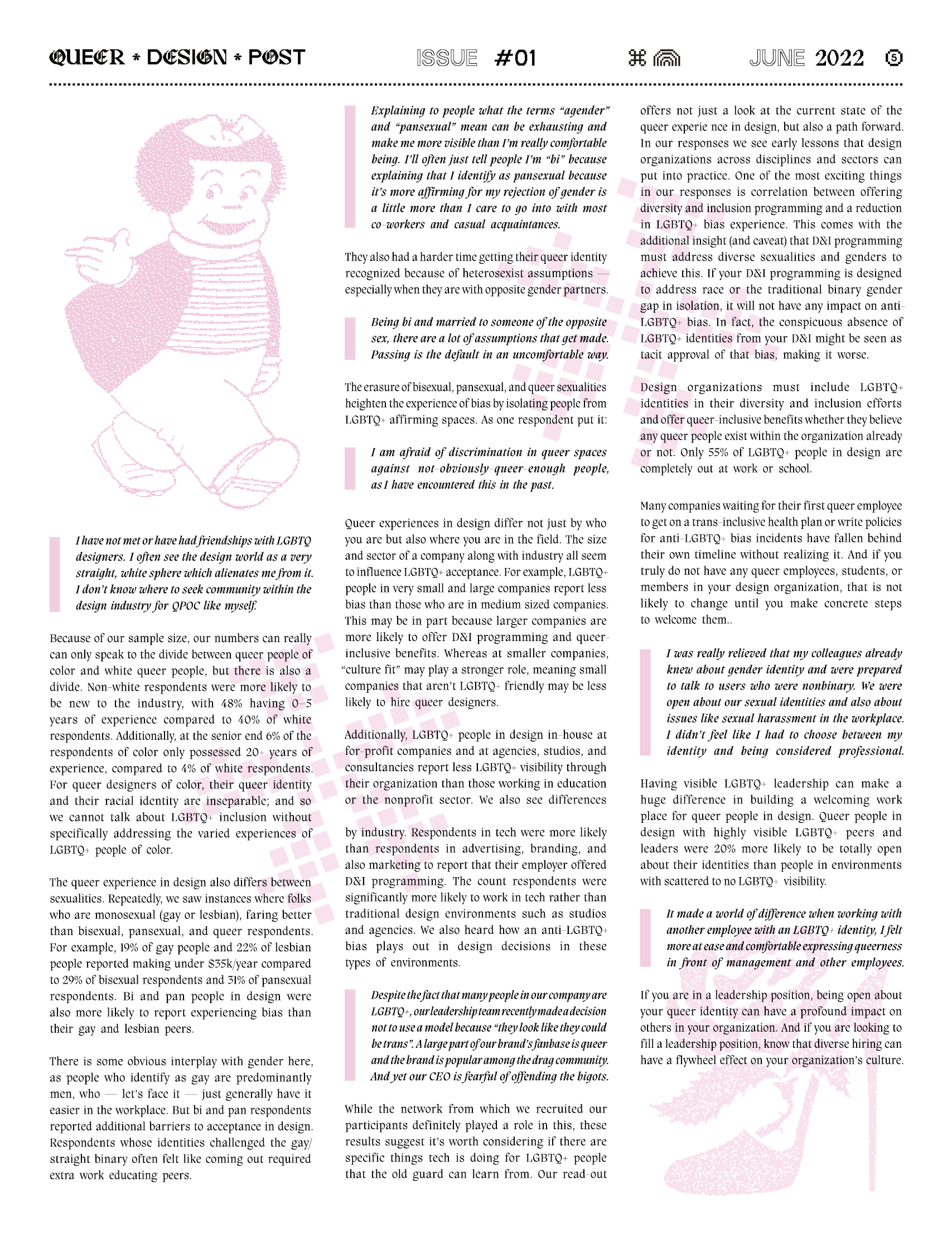
I had the opportunity to visit the Bishopsgate Institute, where I was able to collect a wide range of Queer ephemera. This collection included posters, flyers, and other printed materials that were created for LGBTQ+ events and causes over the past few decades. Each piece was unique and had its own distinct style, ranging from bold and graphic to whimsical and playful. Using these materials as my starting point, I began to develop a design system that reflected the vibrancy and energy of the Queer community. I used the imagery from the ephemera as decorative flourishes throughout the website and newspaper, implementing them into the bitmapped design style that I had created. The result was a design system that was both cohesive and visually compelling. By incorporating the Queer ephemera into the design, I was able to create a sense of continuity and historical context, while also showcasing the creativity and innovation of the LGBTQ+ community.