Foda
Branding / Idenity / Packaging / Photography / Brand Strategy
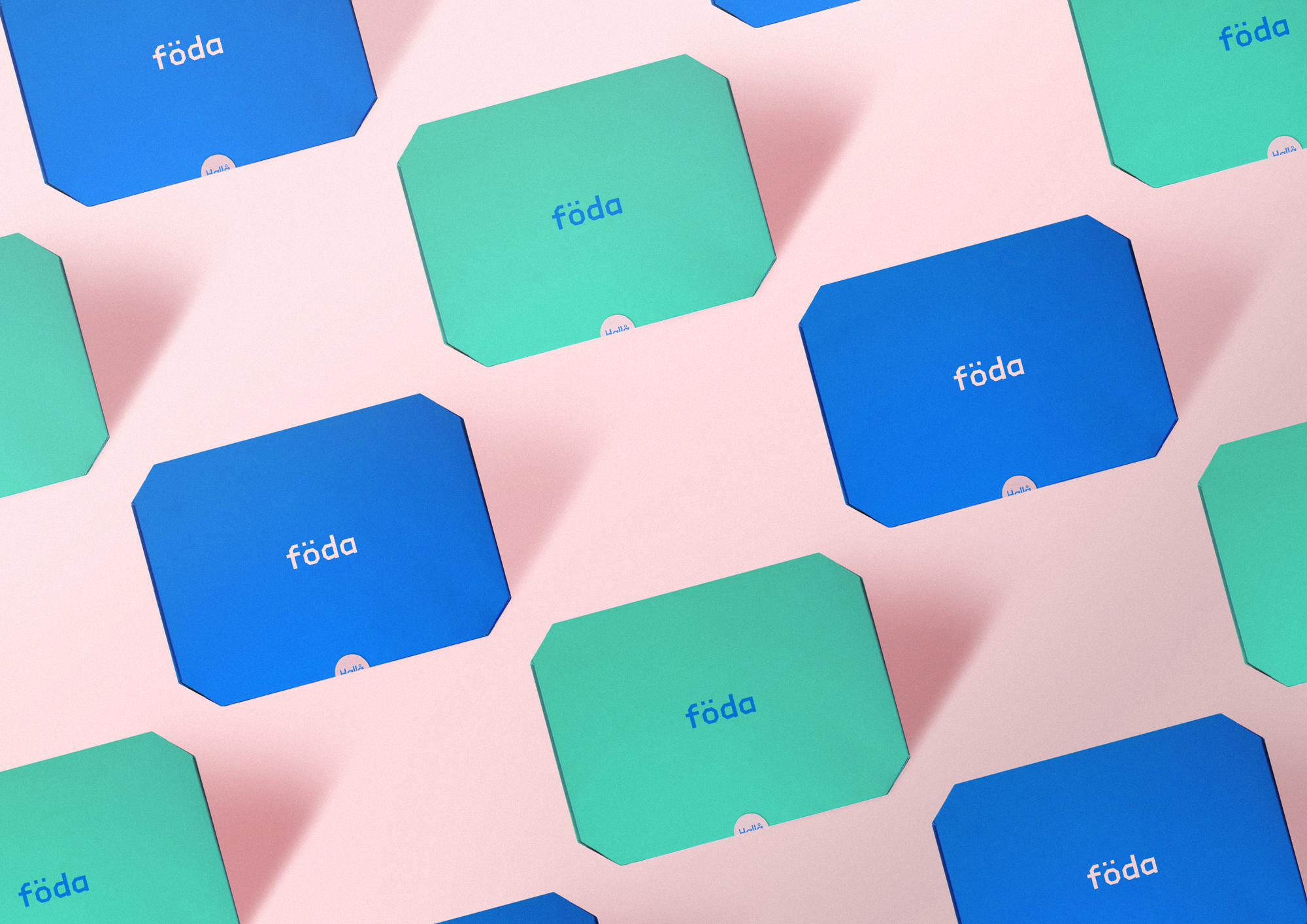
Föda, a Scandinavian-based subscription service, offers a monthly delivery of authentic and delicious sweets and savory treats straight to your doorstep. To create a memorable brand experience and encourage repeat business, the challenge was to design a brand identity and collateral that was truly unique, tactile, and ornate, starting with the packaging design at the heart of the brand. The brand was deeply inspired by the Scandinavian culture, reflecting this in every aspect of the design. The color palette was influenced by the natural beauty of the region, with a nature-inspired green being the standout color. The custom wordmark was informed by the angular architecture found in the region, and the packaging mailers showcased a minimalistic approach to color and form, true to the minimalist aesthetic of Scandinavian design. With all of these elements combined, Föda was able to create a brand that truly embodies the essence of Scandinavian culture and brings it to the UK market.
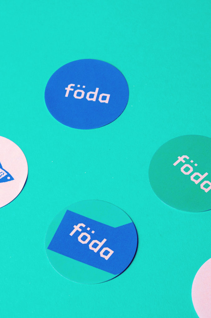
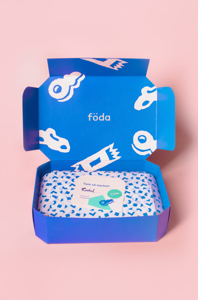
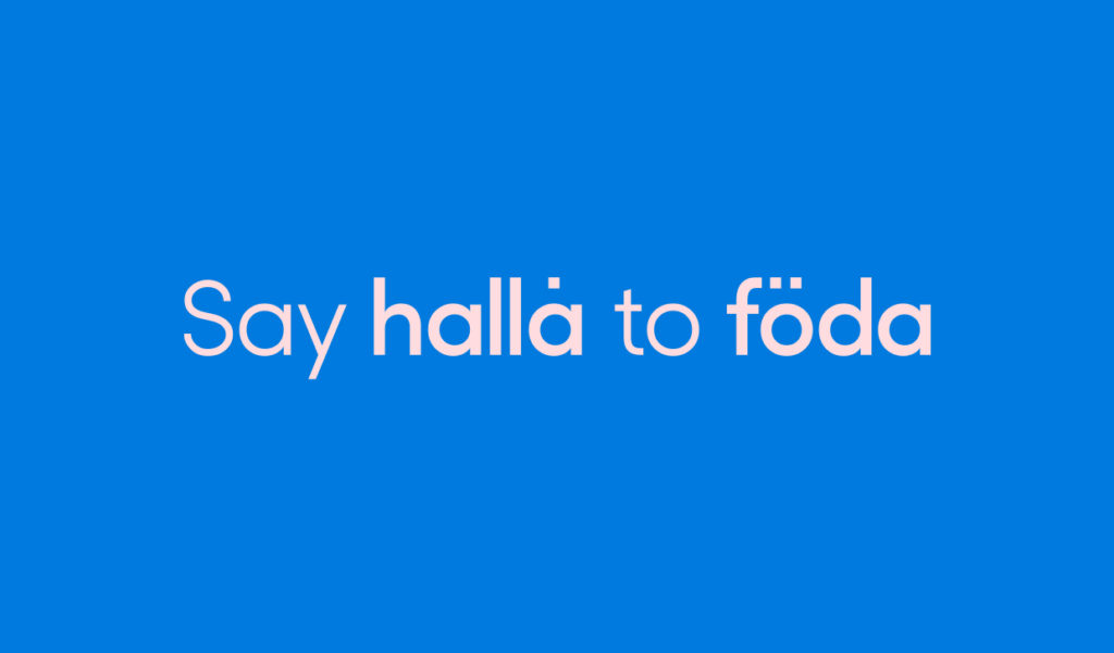
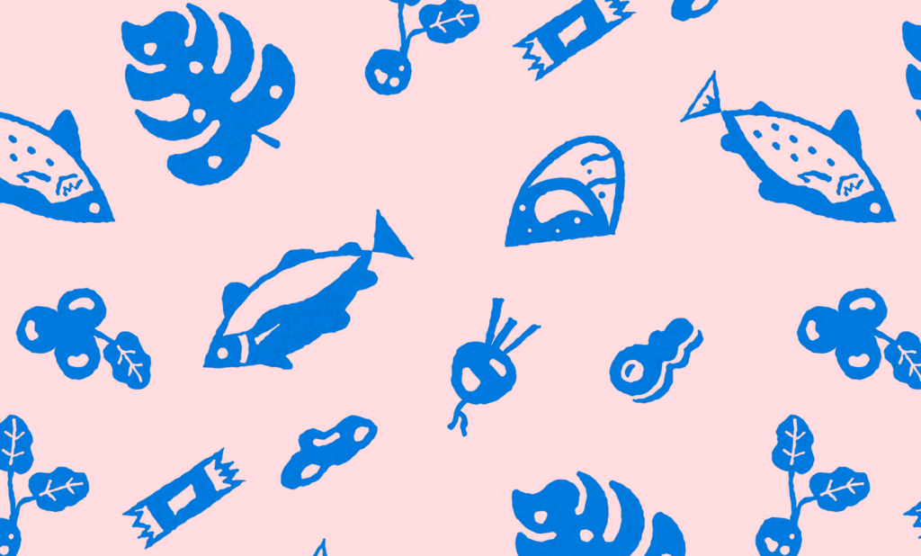
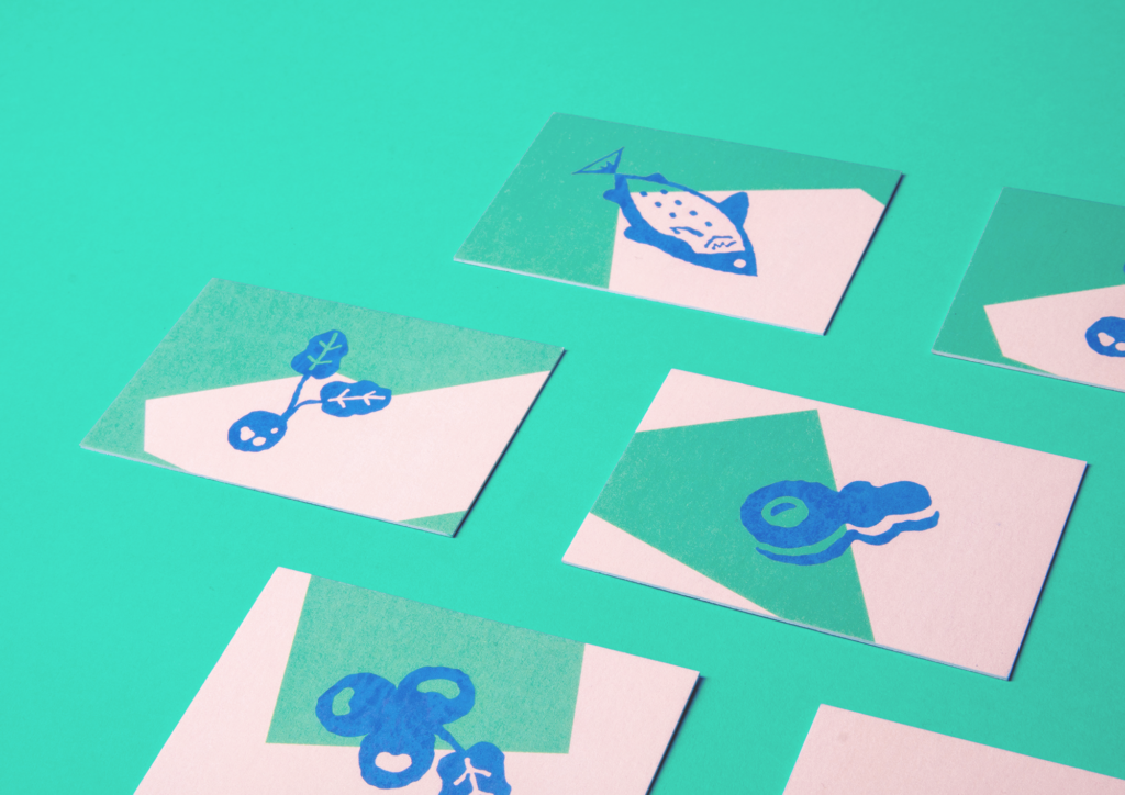
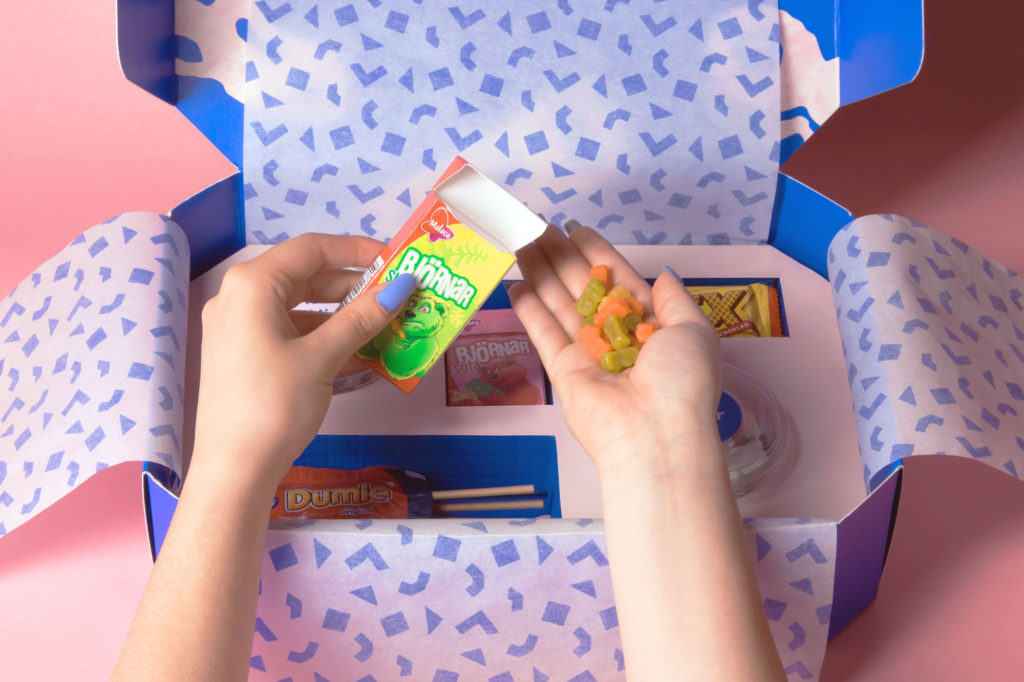
My visual research into Scandi culture and design principles informed every aspect of the brand identity, from the nature-inspired green in the color palette to the custom word-mark influenced by angular architecture. The brand's minimalism is reflected not just in the color and form choices, but also in the typography, where the warm and minimal sans-serif typeface Sofia Pro adds a touch of classic Swiss design with its sleek curves and neutral appeal. The packaging design is at the core of the brand experience and is crafted with a unique, tactile, and ornate touch. Handcrafted illustrations capture the essence of Scandi craftsmanship, while digital geometric shapes bring a playful, modern touch to the design. The brand elements can be used together or separately, making for a playful and harmonious blend of tradition and modernity. The packaging mailers, inside design, and product inserts are all designed with the same attention to detail, making for a cohesive and memorable brand experience with every delivery.



>
